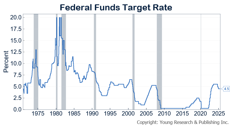
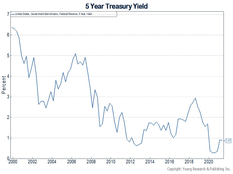
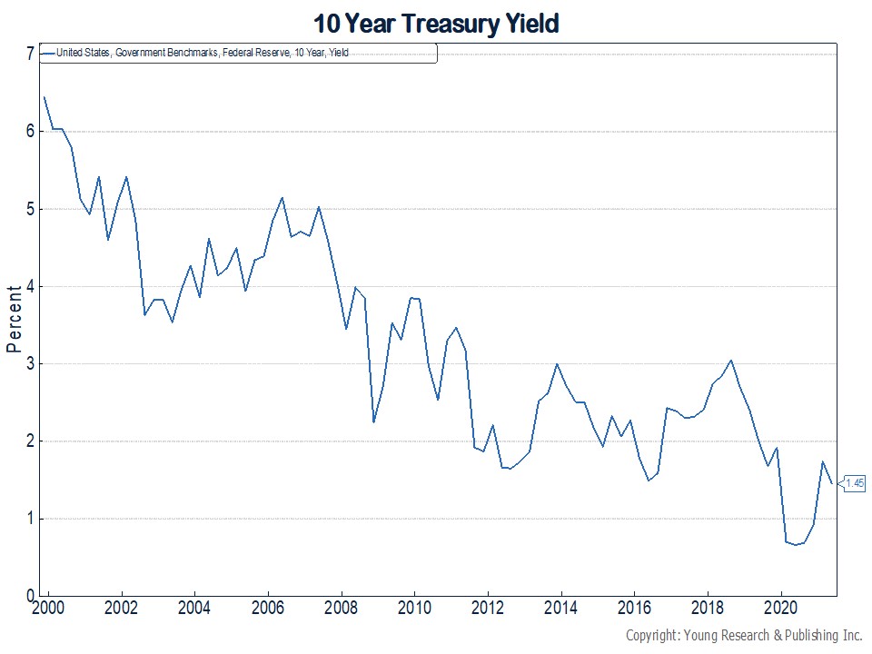
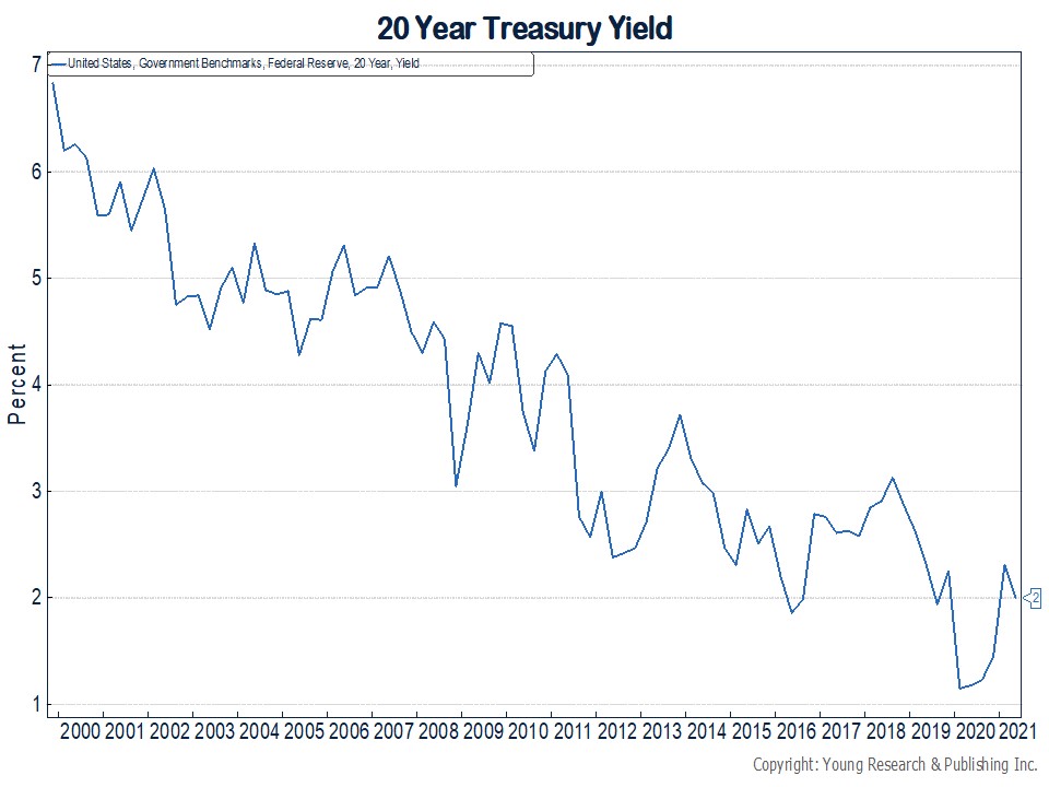
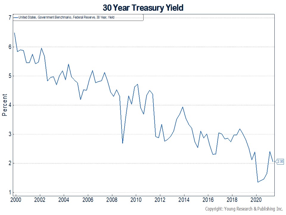
Your Survival Guy received a chart package yesterday that leaves a lot to be desired. I’m talking about the desperate state of the yield on Treasuries thanks to three nasty cracks in the stock market so far this century. Note: When stocks fall, Treasury prices usually rise as investors flee to the full faith and credit pledge of U.S. government bonds, for whatever that’s worth. Take a minute to see how low yields are (which move in the opposite direction of bond prices).
The series of charts below runs from the beginning of this century and displays maturities from as short as 12-months to as long as 30-years. The first set of charts shows you each maturity individually so far this century.
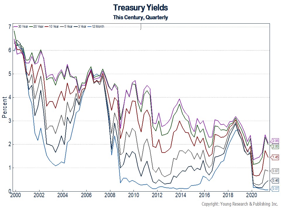
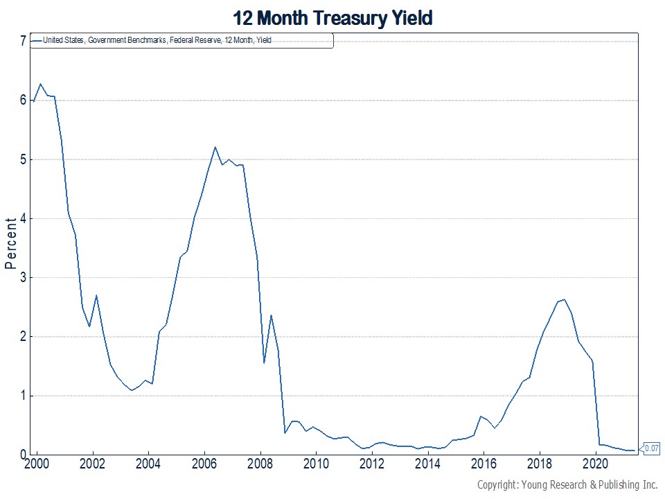
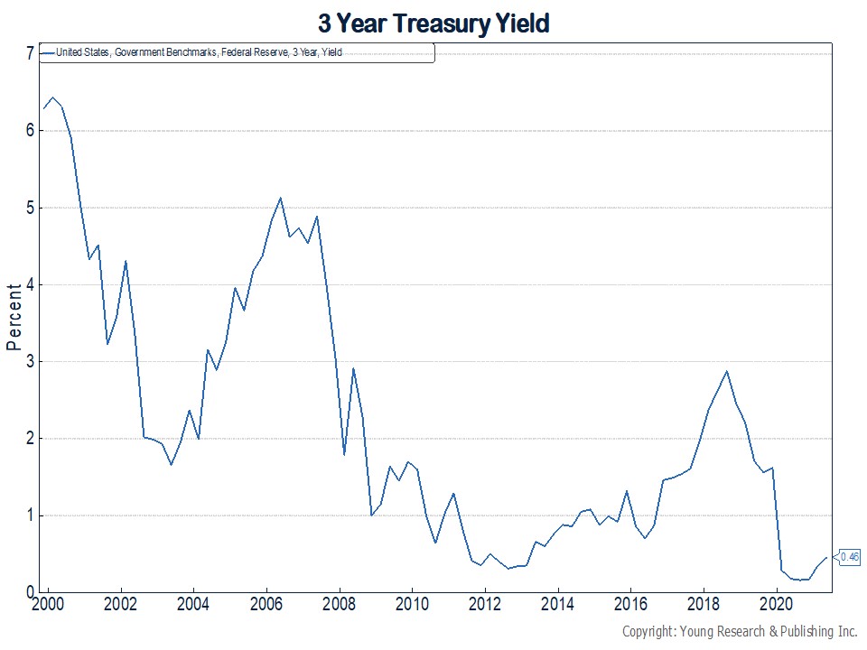
This next series narrows in, like a magnifying glass, to just this year. See below:
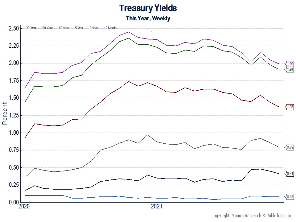
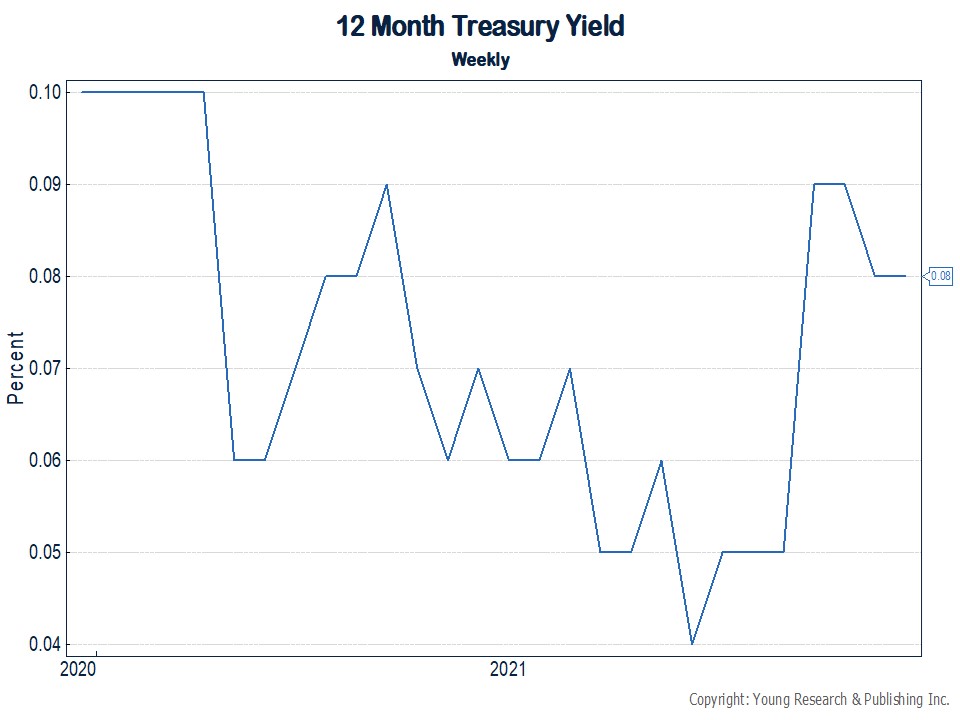
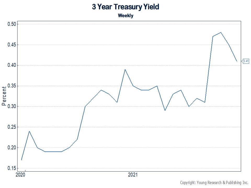
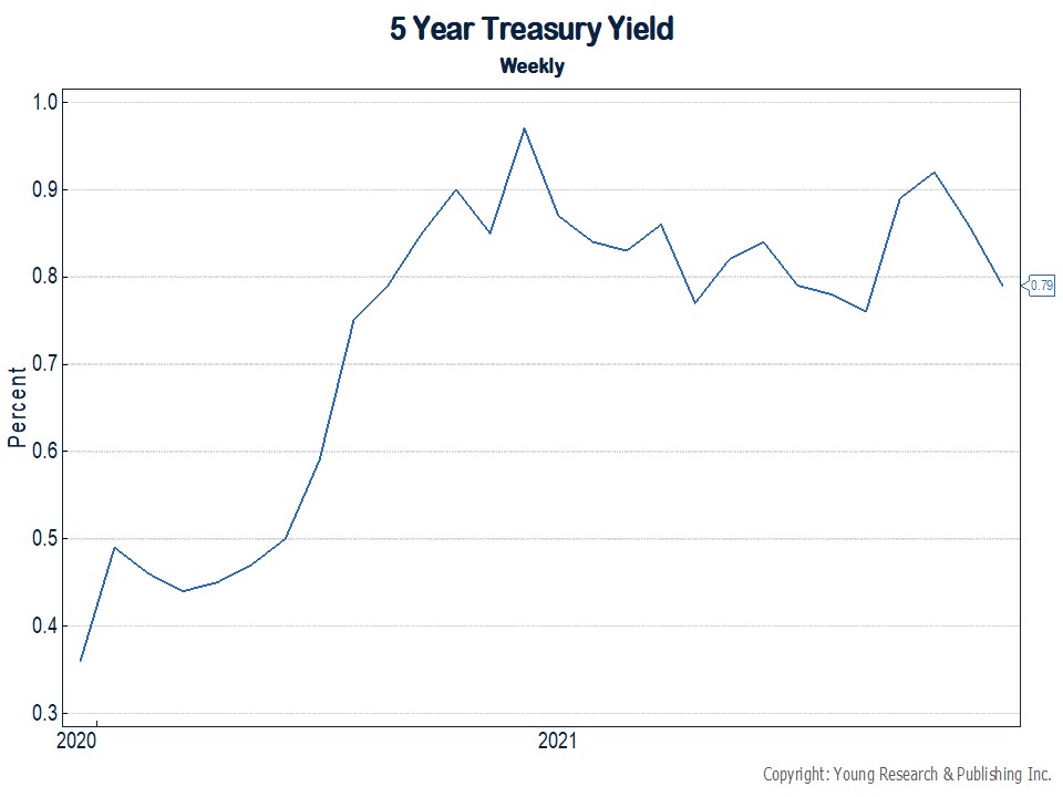
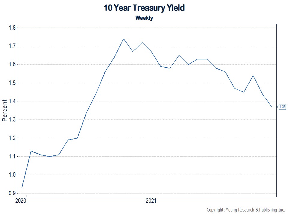
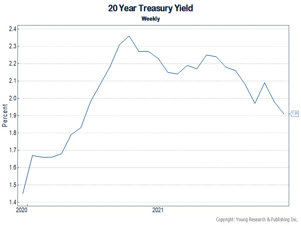
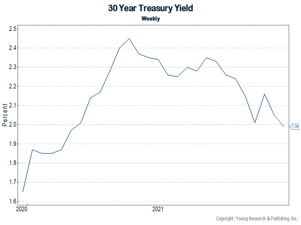
Clearly, the big pictures shows how the Fed has run out of room to cut rates and, if it needs to come to the rescue again, it will need to be “creative.” In other words, we’re in uncharted territory where government officials operate “on the fly.” What could possibly go wrong?
And, in the magnified look, you can see the volatility and the carnage created by the daily swings, especially with the longer maturities.
Action Line: To me, this is not a comfortable market. Make sure the bond component of your portfolio is an anchor to windward. You just might need it based on where we are at this point in this young century.
Originally posted on Your Survival Guy.
If you’re willing to fight for Main Street America, click here to sign up for the Richardcyoung.com free weekly email.


